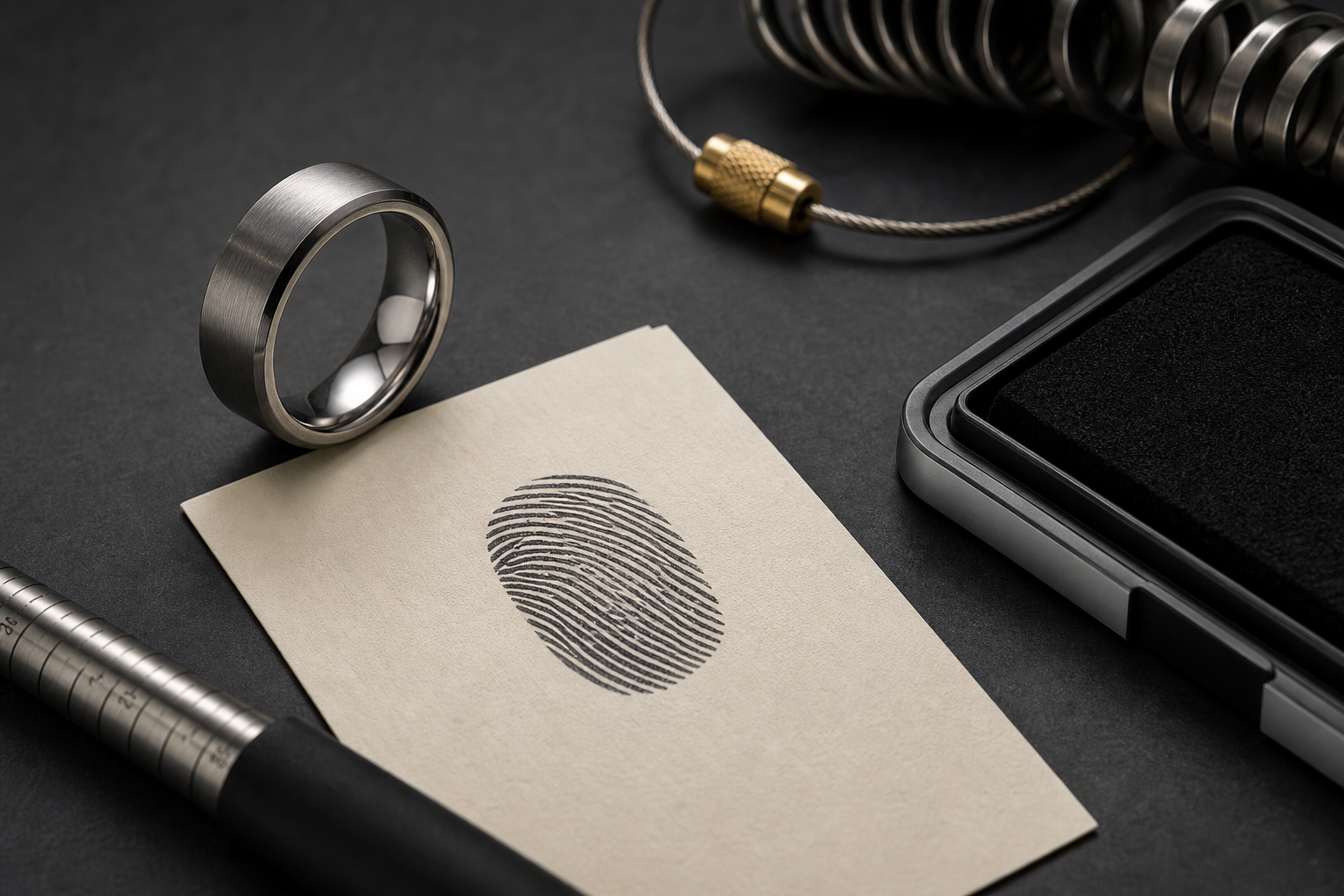

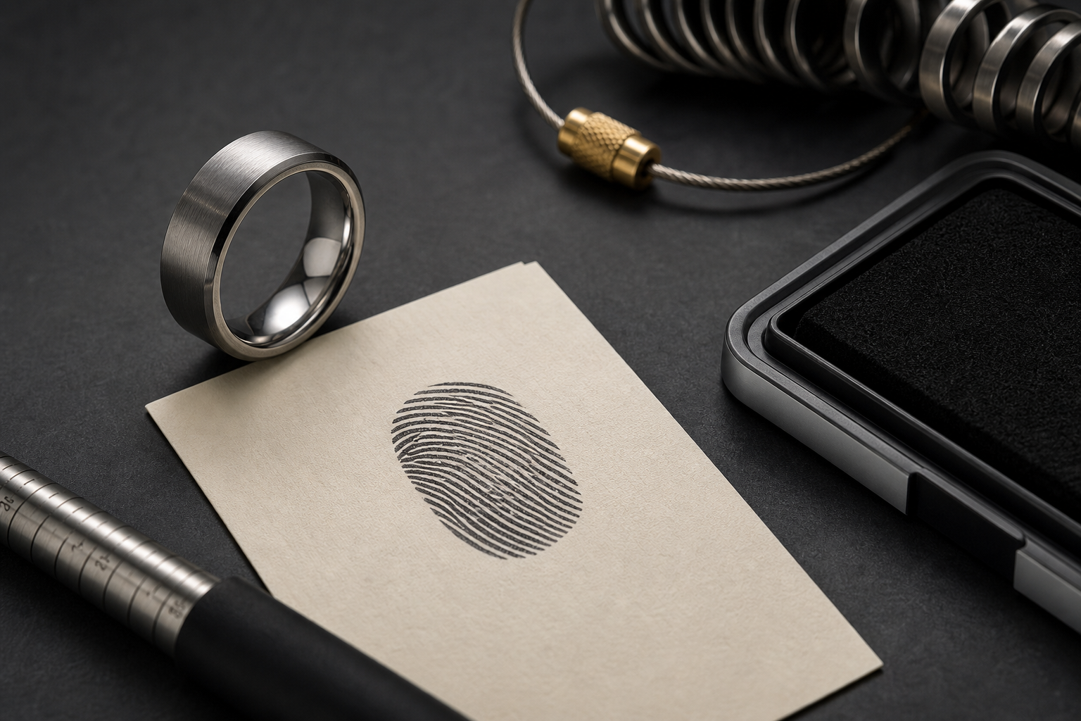
Start with a clean ridge pattern on white paper. A ring built around one clear anchor wears better over time than one built around several competing ideas.
Options worth considering: two or three ink attempts, a flatbed scan, a daylight phone photo, and one cropped close-up of the clearest ridge area. Pick one and let it lead; the rest can stay in the background or come out entirely.
the print can become an outside texture, a small inside mark, or a cropped panel beside initials. Decide this before finalizing artwork, since it changes how much detail the design can actually hold.
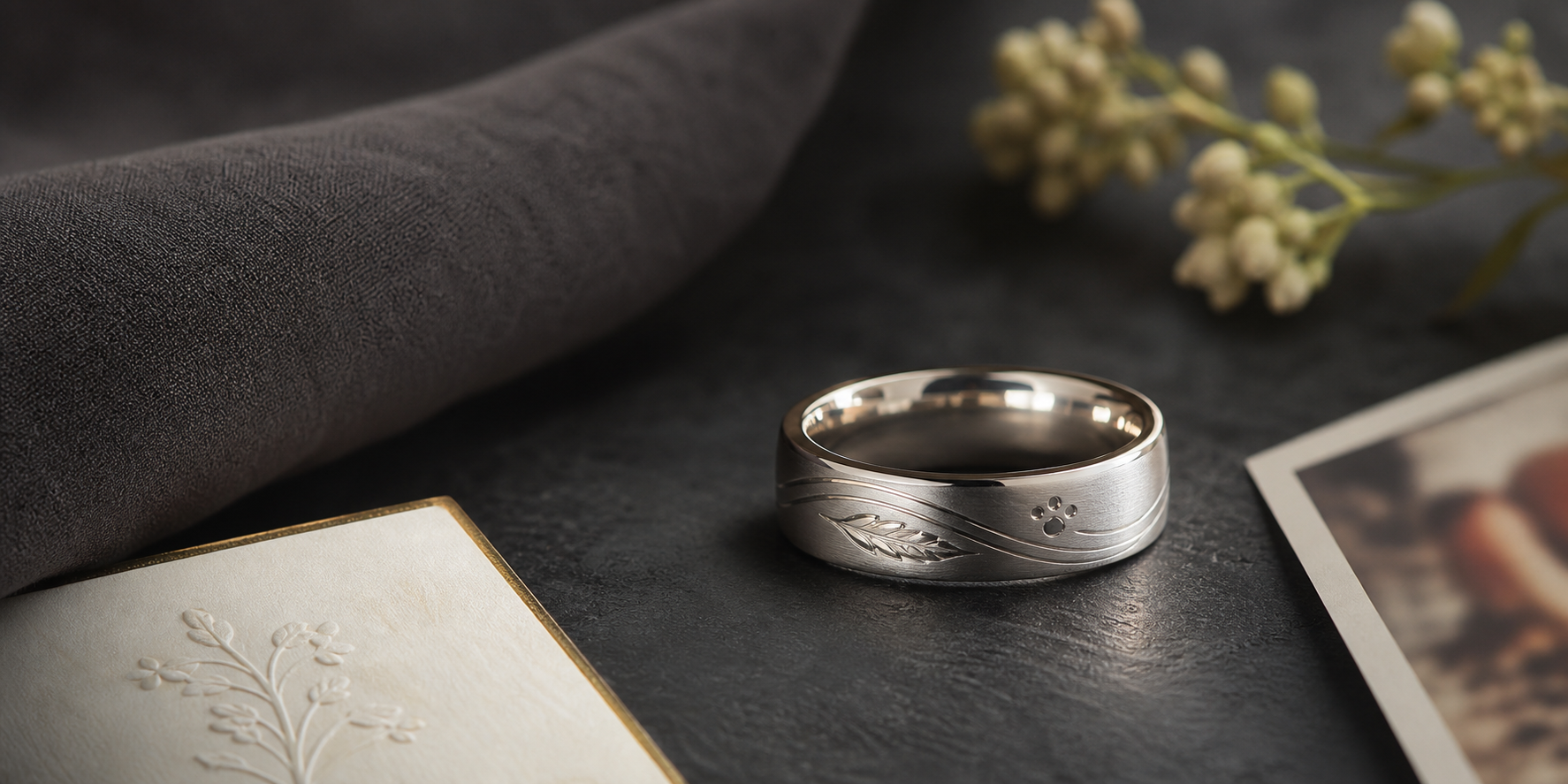
brushed silver and darker grooves usually show print ridges better than glossy low-contrast finishes. Choose the finish based on how the ring will actually be worn, not just how it looks in a first mockup.
the best wording is usually the name, date, or one short phrase that explains whose print it is. Say it exactly the way it should be read, then trim anything that is not doing real work.
press lightly, avoid smearing, keep the paper flat, and photograph the print straight on without shadows. Blurry or low-contrast files force the design to guess at details that should be intentional.
choose the clearest third of the print instead of forcing the full thumb onto a narrow band. Everything on the band should point back to the same idea.
Watch for heavy ink blobs, blurry screenshots, and shiny paper glare make the print harder to engrave. These are the details that look fine on screen and disappoint once engraved.
Before going further, decide whether the print is for a memorial, wedding band, or family keepsake before choosing the final layout. That answer should guide the phrase, finish, and placement that follow.
The next step is simple: bring several print images, the name or date, and a note about the person behind the print into the Friends of Irony designer.