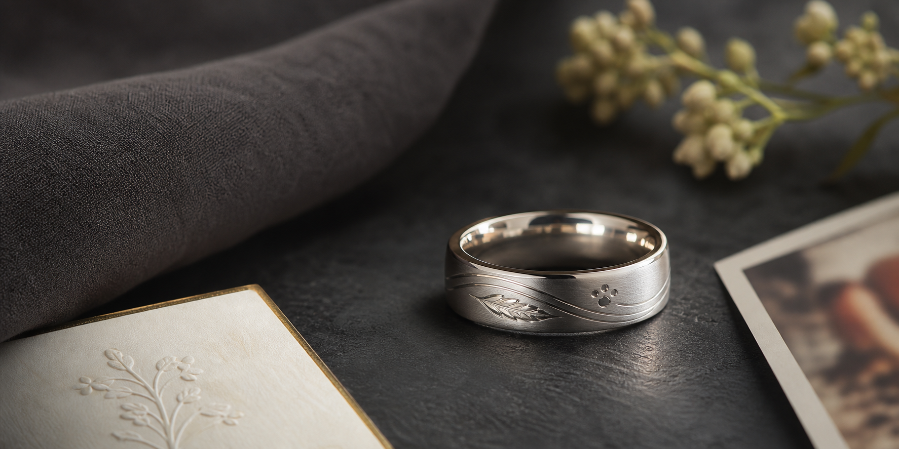

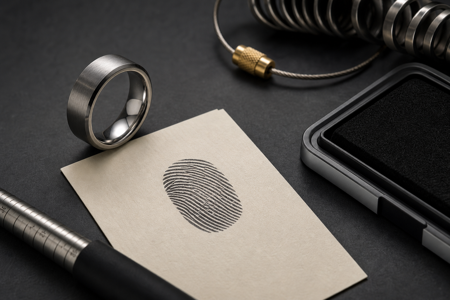
Start with a real thumbprint paired with a name, date, or private remembrance phrase. A ring built around one clear anchor wears better over time than one built around several competing ideas.
A cropped thumbprint, "Still With Me," a first name, years lived, initials, or a small inside date can each work well on their own. Trouble starts when two or three of them compete for the same space on the band.
outside placement makes the print the main tribute; inside placement keeps the memory private. Keeping that split clear is what keeps the ring from feeling crowded.
soft silver finishes feel calm, while dark grooves help ridge texture show clearly. The finish should make the engraving easier to read, not just look premium in a photo.
short memorial wording works best because the print already carries the emotional weight. Fewer words usually engrave more clearly than a full sentence.
use the clearest print available from paper, a scanned document, a keepsake card, or a family file. Good source material is the difference between a crisp engraving and a muddy one.
frame one clean print section and support it with a single name or date. Supporting details should clarify the main idea, not decorate around it.
Skip do not bury the print under multiple symbols, quotes, and dates. What looks like more detail on paper usually looks like clutter on a ring.
Decide whether the ring is for daily comfort, a shared family gift, or a visible remembrance piece. That decision matters more than any single symbol or font choice.
When ready, bring the print file, name, date, and relationship note into the Friends of Irony designer.