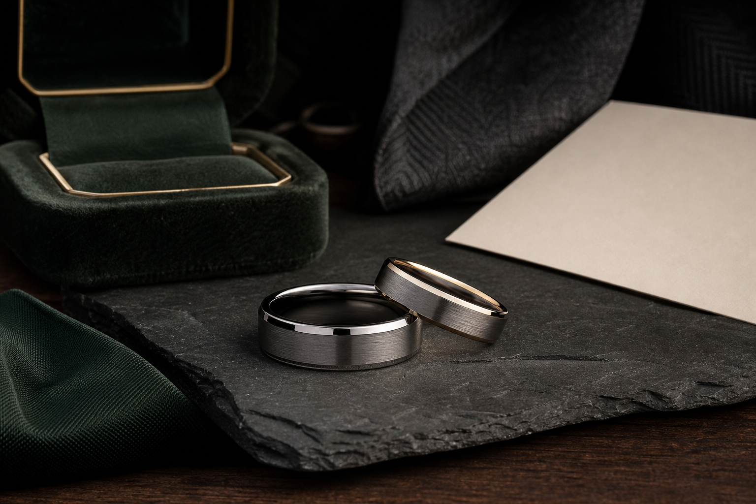

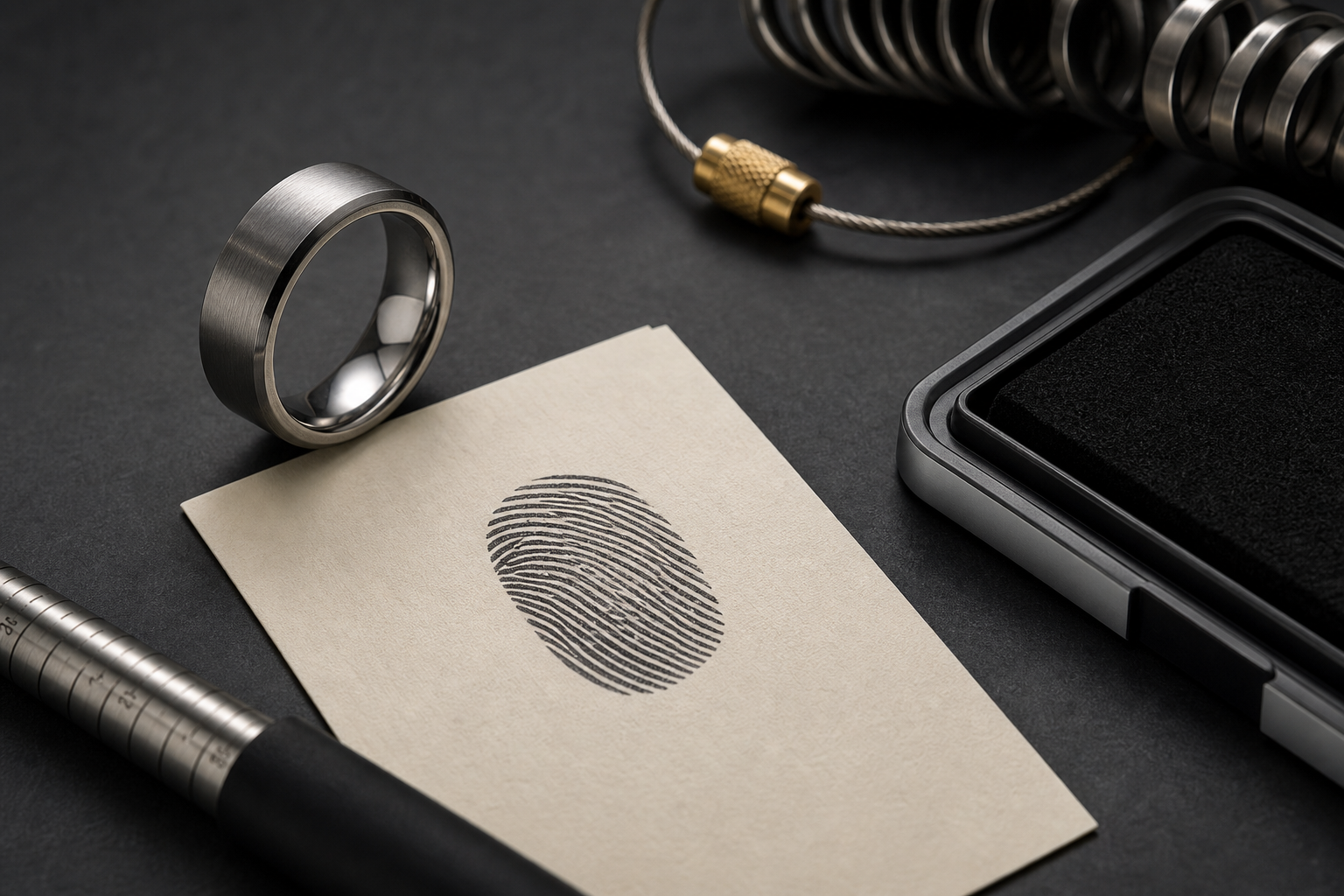
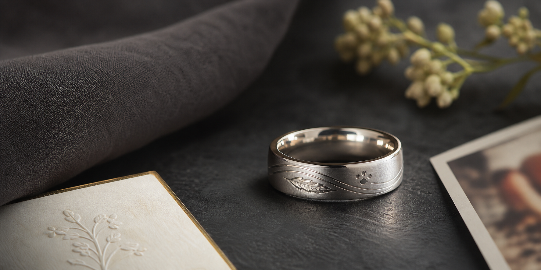
Treat the partners real print paired with vows, initials, or the wedding date as the ring's one job. Every other choice, from finish to placement, should make that detail easier to read, not harder.
Options worth considering: an inside thumbprint, a cropped outside print panel, initials plus a date, or a short vow fragment such as "Always Us". Pick one and let it lead; the rest can stay in the background or come out entirely.
inside placement keeps the print private, while an outside print should be cropped and given space. Private and visible details rarely work well sharing the same space, so give each side of the band one job.
silver, tungsten-style, or black bands can work, but the print needs enough contrast to stay visible. The finish should make the engraving easier to read, not just look premium in a photo.
let the print carry the emotion and keep text to initials, date, or a two-word phrase. Keep a shorter backup version ready in case the chosen band has limited engraving space.
send a clean print image from each partner if the ring is meant to feel mutual. Send the original file when possible instead of a screenshot or a copy of a copy.
combine one print with one wedding detail rather than adding vows, coordinates, dates, and symbols all at once. Keep the layout simple enough to read at a glance, not just up close.
Avoid full fingerprints plus long vows often crowd a narrow wedding band. A simpler design almost always ages better than a crowded one.
Choose whether the print is a private marriage detail or a visible design feature. Everything else here exists to help answer that one question.
With that settled, bring the print, wedding date, initials, and any vow phrase into the Friends of Irony designer.