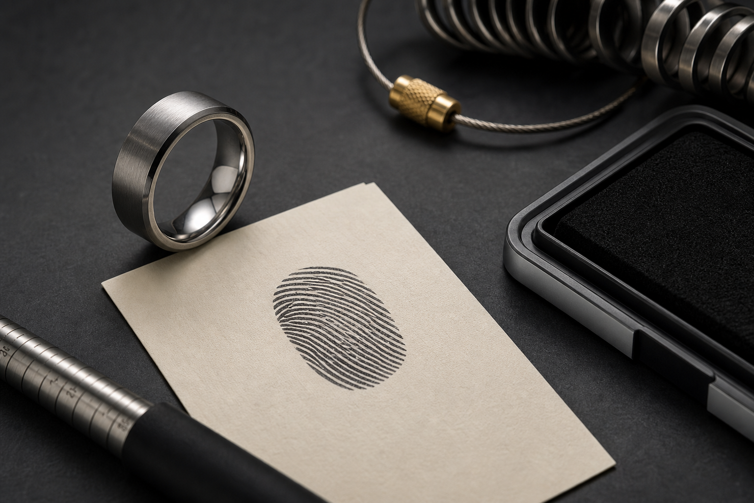

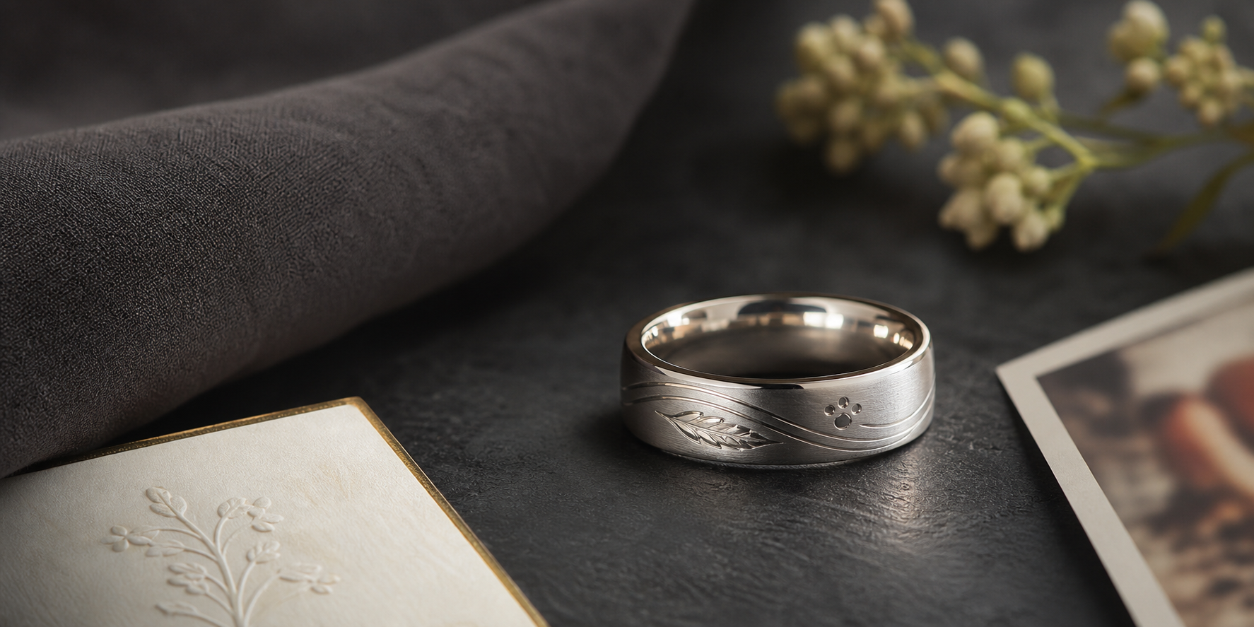
Start with a ridge pattern that has enough clarity to become wearable engraving. A ring built around one clear anchor wears better over time than one built around several competing ideas.
A cropped fingerprint, full oval print, inside print, name, date, initials, or short phrase give you real options. Choose based on what the wearer will still recognize months from now, not what looks strongest in a first sketch.
outside placement makes the print the design; inside placement makes it a private connection. Decide this before finalizing artwork, since it changes how much detail the design can actually hold.
contrast matters more than shine when the ring relies on fine ridge lines. Choose the finish based on how the ring will actually be worn, not just how it looks in a first mockup.
let the print lead and use words only to identify the person or promise. Read it out loud before finalizing; wording that sounds right out loud usually reads right on metal.
send the clearest scan or photo and avoid glare, blur, and heavy ink smears. Prepare this before opening the designer so the session moves quickly.
select one print crop and one supporting text element. Everything on the band should point back to the same idea.
The most common issue is do not combine multiple prints unless the band width can support them cleanly. Catching it before ordering saves a redo later.
Before going further, decide whether the ring is romantic, memorial, family-centered, or self-designed. That answer should guide the phrase, finish, and placement that follow.
Bring it into the designer once ready: bring the print file, name or date, and ring purpose into the Friends of Irony designer.